Most of us treat house paint like a simple background choice, similar to picking the color of a phone case. However, the walls of your home are actually a massive emotional canvas that dictates how you think and act. Scientists have studied the color psychology living room connection for decades, proving that certain shades can actually lower your blood pressure while others can make your heart race. Your living room is the one place where you transition from the chaos of the world to the privacy of your personal life, so the palette you choose matters.
Selecting living room colour combinations is not just about following current design trends or matching your sofa. It is about understanding the neurological impact of light and pigment. When you get the balance right, you create an environment that acts as a silent therapist, helping you recharge or get motivated without you even realizing it. By choosing the best living room colors for your personality, you turn your home into a tool for better living.
Key Takeaways for Smarter Decor
- Mood Control: Cool colors like blue and green reduce mental chatter and promote rest.
- Social Spark: Warm tones like peach or gold make a room feel friendly and talkative.
- Visual Size: Light neutrals can make a cramped apartment feel like a spacious suite.
- Long-Term Comfort: Saturated colors are great for drama but can cause fatigue if overused.
The Science of Warmth and Connection
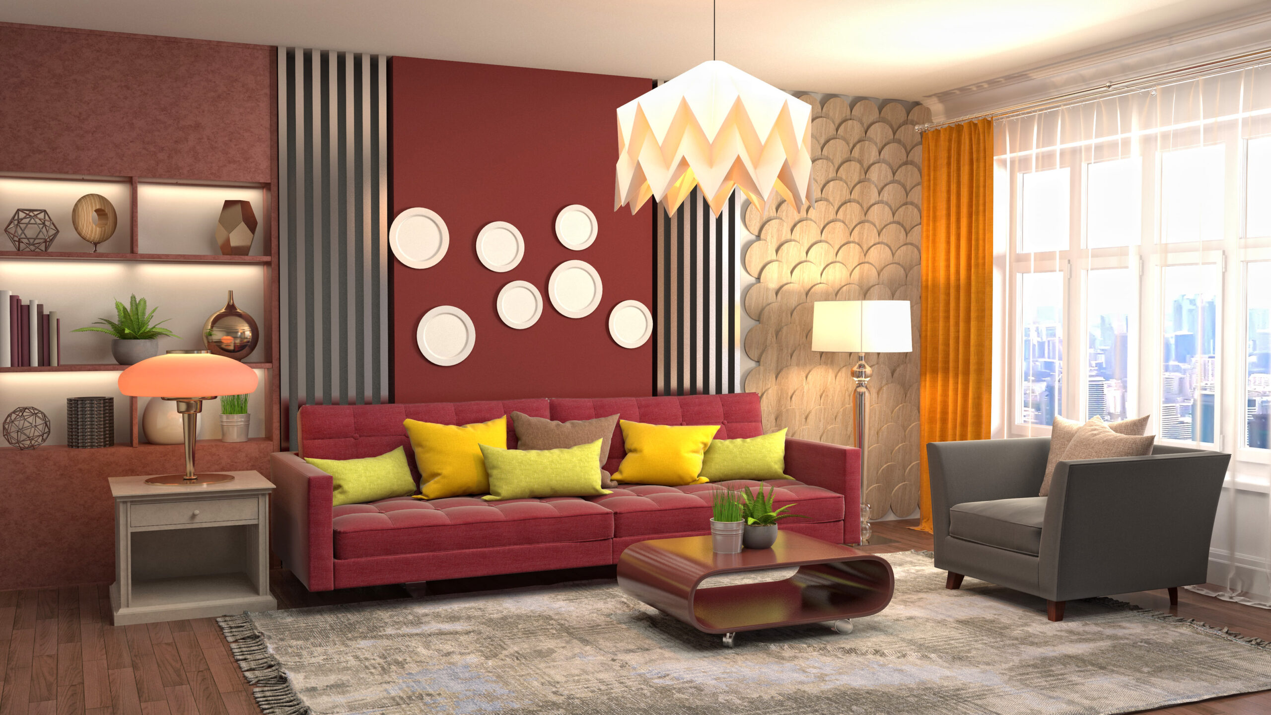
If your living room is the place where your family gathers to talk, play games, or eat, you should look toward the warmer side of the color wheel. Soft yellows, muted oranges, and earthy reds are the best living room colors for fostering human connection. These shades are psychologically linked to the sun and fire, which our ancestors associated with safety and community.
When you use warm living room colour combinations, you are inviting people to stay a little longer. These colors stimulate the appetite and keep the energy in the room high. However, the trick to successful color psychology living room design is to avoid neon versions of these colors. Instead, look for muddy or dusty versions like terracotta or mustard. These provide the same emotional warmth without making the eyes feel tired after an hour.
Engineering Calm with Cool Tones
For many modern homeowners, the living room is a sanctuary for silence. If your goal is to decompress, you need the best living room colors that mirror the natural world. Sky blue, sage green, and soft teal are incredibly effective at calming the nervous system. These cool living room colour combinations signal to the brain that the day is over, and it is safe to let your guard down.
Research into color psychology living room effects shows that people in blue rooms often perceive the temperature to be cooler than it actually is. This makes cool tones a brilliant choice for homes in hot climates or rooms with large, west-facing windows that get baked by the sun. These colors create a sense of breathing room, making your living area feel airy and expansive rather than heavy.
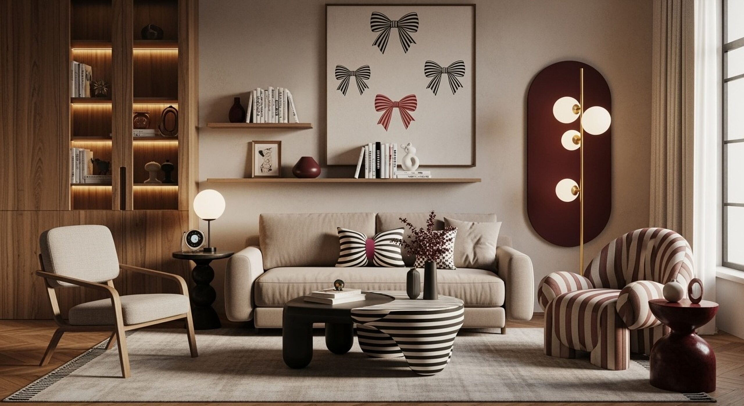
The Hidden Depth of Neutral Palettes
We often mistake neutral rooms for a lack of imagination, but a well-executed neutral space is a masterclass in color psychology living room strategy. Greys, beiges, and off-whites serve as a mental reset button. In a world filled with bright digital screens and flashing advertisements, a neutral living room allows your brain to stop processing complex information.
The best living room colors in the neutral family are those with underlying hints of warmth, like a sandy tan or a warm stone grey. These living room colour combinations prevent the space from feeling like a sterile hospital waiting room. By keeping the walls quiet, you allow the textures of your furniture and the sunlight from your windows to become the stars of the show.
Choosing Between Cozy and Vibrant Moods
Your choice usually falls into one of two buckets: cozy or vibrant. A cozy room relies on deep, dark living room colour combinations like navy or charcoal to create a sense of enclosure. This is perfect for people who live in cold climates and want their home to feel like a protective cave. It creates a high level of psychological comfort and intimacy.
A vibrant room uses the best living room colors with high saturation, such as emerald green or royal blue. This style is for the bold decorator who wants their home to reflect a high-energy lifestyle. According to color psychology living room experts, vibrant spaces are excellent for sparking creativity and keeping the mind alert. The key is to ensure you have enough neutral elements, like a wood floor or a white ceiling, to give the eyes a place to rest.
Lighting: The Final Color Modifier
No discussion of living room colour combinations is complete without mentioning light. A color that looks peaceful in a bright showroom might look gloomy in a basement apartment. Natural light changes from the blueish tint of the morning to the golden hue of the sunset, and your paint will shift along with it.
To find the best living room colors for your specific home, always observe your paint samples at different times of the day. This is the practical side of color psychology living room planning. If a color makes you feel uneasy in the dim light of the evening, it is not the right choice for a space where you intend to relax. Trust your gut feeling as much as the color wheel.
Frequently Asked Questions
1. Can I use dark colors in a small living room?
Yes, you can. While light colors make a room feel bigger, dark living room colour combinations can make a small room feel intentionally cozy and sophisticated rather than cramped.
2. What is the most relaxing color for a living room?
Sage green is widely considered one of the most relaxing choices. It sits in the middle of the color spectrum and is very easy for the human eye to process, which reduces strain and stress.
3. How do I know if a color is too bright for my space?
If you walk into the room and your first instinct is to squint or if you feel a bit restless after sitting there for ten minutes, the saturation is likely too high.
4. Do neutrals affect mood as much as bright colors?
Absolutely. While they don’t spark high energy, neutrals provide a sense of stability and clarity. They are the best living room colors for people who want their home to be a place of mental recovery.
5. How many colors should be in a living room palette?
Most designers suggest a three-color limit for living room colour combinations. Use one main color for the walls, a second for large furniture, and a third, brighter color for small accents like pillows and art.